No matter whether you are the small shop owner or the proud owner of a large chain, the storefront display seems to be the vital factor in attracting customers, isn’t it? While walking on the streets, some storefronts easily catch attention, while some seem to die into oblivion –the reason is they are not so catchy. It is also an important factor to remember that while a gaudy display screen makes onlookers cringe, the too simple one never gets the glance it might deserve. Looks do matter and visitors tend to judge your business from your storefront.
Creating a quirky and catchy display stand does not need a professional designer’s help –only a few tricks and you are all set to compete with the giants by attracting more and more customers. Let’s see how –
Look at your storefront from the different perspective
Before thinking as the store-owner, think from the point-of-view of the pedestrians –how they look? What catches their attention and what not? Now start from the scratch –the very section that is seen from eye-level from the street.
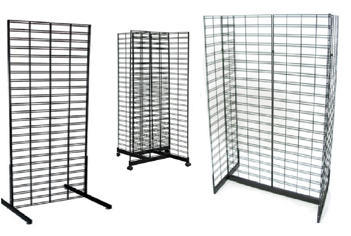
Pay attention to PARC (Proximity –Related things grouped and decent space left for other designs, Alignment – things properly arranged within grid and use slatwall shelves for adding elegance, Repetition –pair certain decorative elements and Contrast –Use opposites like black and white, crowded and minimal, light and dark etc with hierarchy for easy understanding.
Start assembling for your display
This step is easy but important. Put together all the basic components like the tape measure, glue, knife, nails, hammer, hanger, screws and screwdrivers, scissors, two-sided tape, marker, pencil and notepad, colours (according to the need) and finally, props. Props should represent what your business is all about, such as mannequins, clothing and white foam for Winter-garment store.
Picture a theme, tell your story

Being bold and creative is the key to make your display stand, stand-out among other shops. You can add a few pictures or posters or if you are the DIY enthusiast, you can just make a few origami or tissue paper crafts to decorate the display. Instead of using sober colours, go for bold colours which are not so extravagant but catch immediate attention. Think unconventionally so that viewers are tempted to stand back and take a look.
Keep it simple with the perfect balance
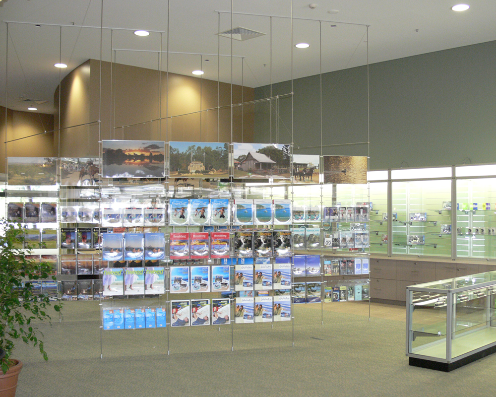
Being bold does not mean you have to clutter the whole window –keep it simple and unique as not to confuse the onlookers. Show the second-best on the slatwall shelves so that customers are always eager to explore what’s inside. The idea is not showing all your cards but showing some gems to keep the balance. The space left will let viewers have a peek inside, have a mysterious idea and urge them to enter. Bingo!
Create a focal point and add lights
When all is done, it is time to add strategic lighting for the display and especially on the focal point to highlight it. Check whether the shadows are congesting the display elements. If yes then utilize the lighting in such a way so that the shadow creates a backlit feature to your focal point. Use soft LED lights, quirky fairy lights or electronic lights to add depth.
When all the decoration and lighting is done, come out and check the store display from every possible angle. Judge from the visitors’ perspective and ask yourself how it looks and what is missing. If you find anything not up to the mark, try to modify. The creativity is within you and taking inspiration from another attractive storefront never hurts!

